Before I started this self branding project I looked into website building for the Leeds Art Party. Wix was a great platform for this so I tried it again for this project. I used a portfolio design platform for a starting point and then drew up a few thumbnails. However, from past experience I knew that tumbril sketches rarely turn out okay on screen.


I also felt that I was drawing out thing tat I didn't know were possible so I re started by getting together some of the resources to enact the pebble button idea, just to see if it could work and then go from there.

In order to capture each of the pebbles in their entirety I used a tilt and shift lens in order to get the angle exactly right. As well as creating continuity between the pebble I have already etched with my branding The idea of using pebbles as buttons is intended to create a crisp yet tactile impression. For the sake of practicality and the image of professionalism my self branding needs to be clean and relatively neat but I also want to communicate the tactility of my design process and outcomes. These pebbles seemed to be the best way. When disconnected from the beach settings the objects have a certain quirky beauty in their imperfect shapes which fits my identity perfectly.

To keep the page as simple and clean as possible, I made the button text visible through a rollover function. I designated the categories of work from my website map that I made earlier.

I used a regular version of baskervile to create a connection to my logo which is an altered form of semi bold baskervile. A lot of scale altering was needed to create buttons that ere legible and functional.


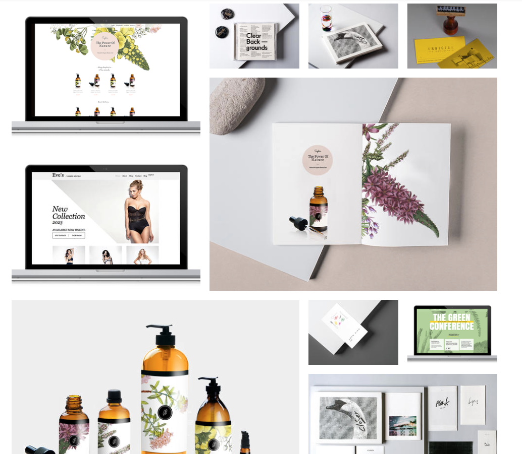
To display images in the discipline gallery in a way that fitted the clean spacious visual I established on the home page I made adjustments to the image spacing and framing that can be seen below.

At this stage I went through many changes of the logo because I wanted to create continuity throughout the website and the image I had planned on using as a header or landing section used the logo etched into a pebble which looked great but didn't work with the aesthetic to the pebble buttons lower on the same page, so some experimentation was in order.

I tried taking a photo of the logo stone in the same high exposure full field of focus way to create a link to the other pebbles but the text was far too small on the pebble and getting the laser cutter to work again is nigh on impossible.

So, I looked at using a digital version of the text for a digital platform. I also used a different image. Although this does play on the pirate overtones that inadvertently come out of the logo, I feel ok about this in this situation because of the grey colour tones coming across from one area of the website to another which convey a clean professional feel that pull the design away from the pirate.

I then tried altering the pinkness of the etched logo stone in an attempt to make it work but I admitted defeat.

To create a link from the landing image to the pebble buttons I created a logo pebble button that uses the same components of the other buttons, basically digital text over an image.

In context with the other pebbles this seems to work a lot better an be much more legible. The question is whether the etched lettering could work for all the printed material and the digital lettering for the digital, I will tackle tis when I come to it.

I also looked into creating a cohesive mobile site but there were a few issues that I had to solve. The first was the default appearance of the control bar that would be useful for more complex sites but not for my own.

The second issue was the fixed menu icon that would get in the way of some of the content. It did very little because I have already integrated the functions of the website into the design elements I created. I got rid of the menu icon for this reason.

There is still much image editing and project selection to go but O am almost there now.
No comments:
Post a Comment