Friday 25 April 2014

OUGD402 PPP Pursuing a New Process Hand Drawn Type

Just recently, especially through the Type and Eye project I have developed an awareness of hand rendered type styles especially lettering. I have been building on this through my type journal by documenting the pieces that really grab my attention. I have really wanted to be able to do my own hand rendered type for a while and I attempted to do so in my Sin City Poster. However, I wasn't thrilled with the results so I have started to copy other peoples designs to form a selection of styles that I can draw from and combine in my own designs.
This design is from one of my type journal entries.


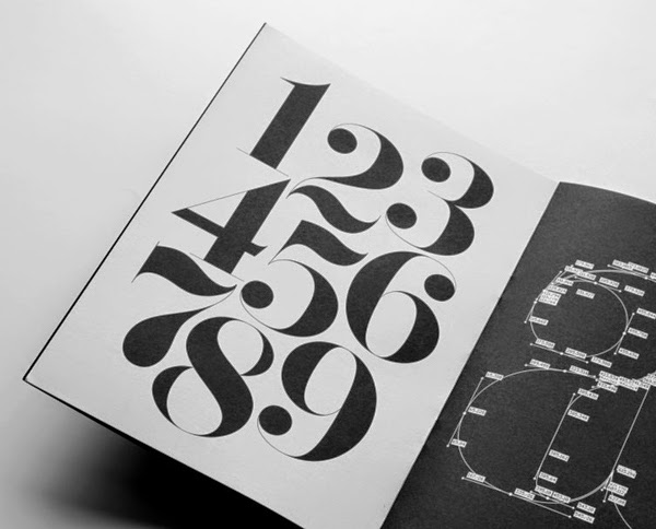
This is another type journal entry design. I will continue to do this for as long as it takes to get to grips with as many styles as my brain can take so that I can start to create my own styles.

Monday 7 April 2014

OUGD402 PPP Brief 02 Digital Mock ups of Info Pack

I have gone ahead and designed the slogans on each part of the info pack along the lines of the central logo I designed for the loquacious student. Although this doesn't show every aspect of the pack it gives an idea of the direction I am going in.


Next I will look into all the different types of each format can be found and how this will effect production methods. 

Sunday 6 April 2014

OUGD402 PPP Brief 02 Logo Designs


Something that has interested and inspires me for a while now is hand rendered lettering and specifically chalk art, as can be seen below.


Carolina Ro chalk designer - photography by MAROfoto #chalk #chalkboard #chalkdesign #chalkdrawing #chalkart #artist

Chalkboard backdrop
I have drawn on these kinds of designs for my logo because not only do I love them but the idea of chalk boards is synonymous with that of learning and growing, which is something that I am doing a lot of at the moment.
So, I started with one of my favourite fonts, Georgia and switched to the italic bold version because I wanted something satisfyingly flowing to reflect the flow and meaning of the word which is directly 'liquid speech.' I then joined up the letters ensuring this was done all at the same angle.

I used whit on green because I wanted to maintain the idea of chalk even if I am using a digital format and the green is because I am from a very rural place and a lot of my designs relate to my love of plants and botany.


I didn't like the way the placement of 'the' made the stem of the 'u' look like an 'i'.


It started to look a little too much like a surfing brand.


I went through a number of different iterations of the design but finally, for the moment, settled on this. I am of course aware of the difficulties of digitally printing green and perhaps will combat this by screen printing everything, this way I can have complete control over the colour outcome.

I will use this font and aesthetic to shape the writing on all parts of my information pack.

UGD402 PPP Brief 02 Rationale and Development of Idea

In the previous post I outlined the idea of 'The Loquacious Student' and the info pack being in the form of 'Tea for Two' To chat over. To make this really work I have gone through each of the questions I answered in the background considerations and how they will fit into the tea set Idea.

-who are you?
The loquacious student, Elisabeth Taylor
This brand could be on the back of each aspect of the tea set and where ever possible.
-what have you learned?
The major thing I have learned this year is that the balance of concept and aesthetic in design is hard to achieve and something that I constantly keep an eye on. This could be put on the tag of a tea bag with 'infuse with concept and aesthetic'.
-What skills do you have?
 I had two idea surrounding this. The first was how I have learned to critique mine and others work but I found this difficult to fit into the tea set idea. I them realised that another thing that I have had to learn is how to organise my time. So,  I think I want to make a little booklet that is a joke on the way that a graphic designers life is really a never ending list. Something that folds out and out to show that one item on one list leads to more on another.
-what do you know?
The thing that I really know now is my design process and how I work as a graphic designer. The major aspect of this (and that fits into my branding) is my need to talk about my ideas, get them out and get peoples opinions. This brought me to the idea of packaging a flapjack with the words 'Chew over with other people'.
-what do you believe?
the major thing that I have come to believe during this year is that graphic design is a powerful tool and it needs to be respected and used well. I thought I would translate this to some cup holder runs and print them with the words 'respect the craft, handle with care.'

In short, I want to create a tea set watch outlines my central beliefs and style as a graphic designer, as if to a professional who might employ me.

This will include:
-Coaster 'Take the heat'
-Tea bags with tags 'infuse with concept and aesthetic'
-Never ending list 'accept the lifestyle, live the list'
-Packaged flapjack 'Chew over ideas with people'
-Heat sleeves 'Respect the craft, handle with care'

The word based nature of this branding fits with what I am saying about myself...That I am good with words.

This will also be packaged in a box as if I were going to send it off to prospective employers. I am uncertain about a name as of yet but am thinking about either, 
'Tea for Two to Talk'
or
'Tea for Two, Make the Perfect Creative Brew'

They both fit but I like the way that the second outline the fact that all of the aspects come together to make me as a designer.


OUGD402 Brief 02 First Thoughts and Idea Development

As part of our personal and Professional practice work we have been asked to fulfil the following brief.

To start off with an to ensure that I have fully fulfilled the brief I produced a mind map answering all of the questions outlined in the background considerations.
The most dominant question when it ones to self branding is 'Who are you?'
I have come up with two options for both visual and conceptual directions to go in.

- The first and most obvious answer is Elizabeth Taylor. This suggests a visual direction of the classic,black and white persuasion as a play on the fact that I share a name with a famous 1950 screen siren. i could play on all the visuals of films and poster of the time.


- The second was actually an idea I have come up with before we got given this brief and it is based around the idea that the most defining point of my character is that I can talk and chatter about graphic design till the ends of the earth, or anything I am passionate about to be honest. I came up with the name 'The Loquacious Student'. The languid nature of the word suggests quite a flowing typographic aesthetic. I would also like to play on the idea of the written word (which also form part of my loquacious nature if you hadn't noticed) by including almost calligraphic aspects. 

By the way the word loquacious means very talkative or chatty but also has a slight negative connotation of over talkative which suggests a slightly self deprecating side that all self branding needs to not be over self praising. 

When Considering the format of this information pack I started thinking about what I would want to receive if I were a professional and what would grab my attention. This would be something useful or interactive in some way so that it is not simply something you are expected to look at and read. I am slightly more swayed towards the loquacious student idea because I feel it has more opportunities of creating something individual. So I was thinking about chatting and the different ways people do so. It then came to me that I could create some sort of branded tea set that promoted all of my answers to the questions in the background considerations of the brief.

Tuesday 1 April 2014

OUGD402 Study Task One Why am I Here and What do I Want To Learn

Because the structure of the study tasks was not made at all clear this task has only just been made live and was not briefed at the beginning of the year. So, I will do it retrospectively, looking at what my responses would have been.

5 Reasons why I wanted to study this program. 
-I wanted a course that would push me to be better.
-I wanted a small class size to promote a sense of community.
-I wanted a college that allowed all students access to all production methods.
-A written reflective aspect that complimented the practical side of the course.
-They made it hard to get on and so I had to try.

5 things I want to learn.
-As much about the nuances of typography as possible.
-To refine my own personal design practice.
-Understand the balance between aesthetic and concept.
-How to make contact with professionals.
-The relationships between colours and how to manipulate them.

Strengths.
-Very though full assessment of a problem.
-Communicating effectively both vocally and in written format.
-Thorough documentation of design process.
-Eagerness to chat about my own and other's projects.
-Openness about my work even when it is bad and needs improvement.

Improvements.
-Ability to take criticism.
-Visual translations of concept based projects.
-Ensuring the design and style suits the brief rather than what I wanted to do.
-Go beyond my comfort zone and try more high impact aesthetics.
-Achieving a smooth slick aesthetic as well as a concept based design.

Evaluation Methods.
-Taking stock and writing on my PPP blog after each module and as many briefs as possible.
-Returning to these improvements in each of my module evaluations.
-Comparing my work with my piers on the course.
-Bring up these areas in individual tutorials with tutors.
-Continual awareness of these areas during each brief.

Questions.
-Can I manage the work load on this course.
-Does my illustrative style have a place in graphic design.
-Can I make contact with professionals and gain for the dialogue.
-Is it possible to balance the concept and aesthetic of a project.
-What are the psychological aspects of graphic design and how can they be utilised in the design process.

Inspirations.
-Terry Pratchett
http://www.terrypratchettbooks.com
(Author of fiction, great comic timing and sense of humour and ability to think in a completely amazing and unexpected way)

-Joseph Fink Welcome to Nightvale creator.
 http://podbay.fm/show/536258179/e/1339761600?autostart=1


-William Morris designs

william morris
-Hand rendered type Bryan todd


http://bryanpatricktodd.com/blog/?offset=1381195411858
bryan todd
-Jane Ray Illustrator


Fields of Creative interest.
-illustration 
Jane Ray
-Packaging
-branding
-Advertising
- wallpaper patterns
-interesting ideas and concepts (white horse)
What a horse is, rather than simply what it looks like. Capturing the experience of the horse in a few flowing lines.

-Type
- Hand rendered Type


-Graphic Novels.
- Moving image design.


http://vimeo.com/31915813