Thursday 15 May 2014
Wednesday 14 May 2014
OUGD402 PPP Presentation
This is the presentation I made to the class. Hopefully it mad sense because I wanted to link it to my self branding process as can be seen by the structure. I think it was relatively well received.
OUGD402 PPP Brief 02 Final Piece
I am really pleased with the final piece of this brief and am surprised with what I have managed to achieve in the time I had.


I really do feel that this pack does represent me as a designer at the moment. I would quite like to continue working on it over summer so that I would feel comfortable actually sending it off to professionals. However, I also feel that although the idea is great and definitely conveys my beliefs about design, I, myself am more gritty and earthy than is possibly conveyed by this pack. I could possibly use one of my interests as the focus for the brand rather than one of my personal traits.
OUGD402 PPP Brief 02 Screen Printing
Once I had the positives printed I exposed a screen and started to mix the ink.

I started with a dark green and continued to add white and a light blue in small increments until I had achieved he closest match to the colour I had digitally selected.


It took a very long time and a sample of the paper that I intended to print onto.

Something that I discovered was not only that mixing a precise green is incredibly difficult to create but that when printed and dried to colour get considerably darker than its appearance in the pot.

I exposed the screen twice because of the number of things I needed to print.
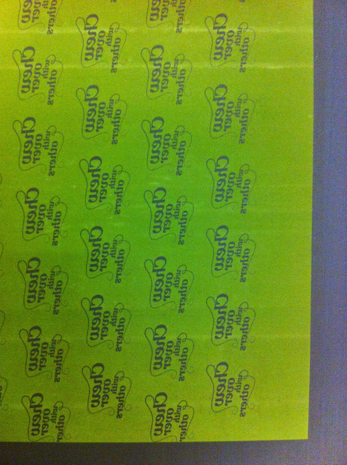
I included a reverse of the print shown above on the second exposure because after printing some of the other designs I found that it was a lot of green and this pattern for wrapping the flapjacks was perfect opportunity to reduce this.

There was a little difficulty with the delicate curls of the calligraphic flourishes, but after some work with the pressure washer they were cleared for printing.

Because the prints had such a large amount of flat colour of the ink it was difficult to achieve consistent colour. However, there were few prints that worked out and that is all I need.


I had a bit of trouble with the paper sticking to the screen and flooding back made the ink far too thick.


I was unsure if the ink I had mixed for the white paper print would look the same on the brown paper of the bag so I tested it out while my second screen was exposed.


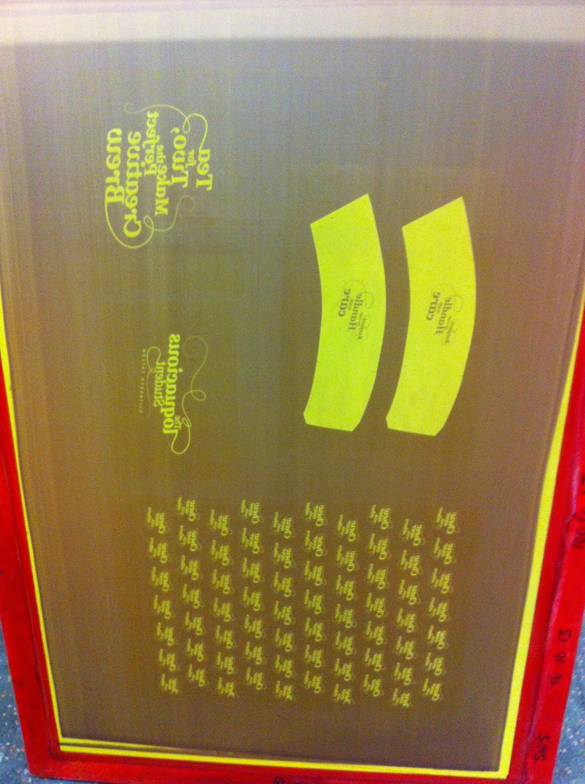
This is the second screen exposure with the paper bag designs and the coater and wrapping pattern.

Once the designs were printed I cut out everything and ensured that the cup sleeves were fitted to the cups that would form part of the pack.

When it came to the note book I wanted to bind it in a way that the pages could be torn out as the lists are finished.

So, I simply layered PVA glue onto the top of the book like the first half of the perfect bind process.

I then weighted and flat tent the book while it dried .

I tried a couple of times to cut out the coasters by hand with a scalpel but found that they just appeared too uneven. So, I used a circle which allowed me to use heavy card as the central piece to create that heavy 'coaster' feel. I used the circle cutter to create the guide groove in the card which I then followed by cutting by hand to get all the way through.
Friday 9 May 2014
OUGD402 PPP Reflection On Rossington Street Print Menu
I am really happy with the way that my print menu has come out. I have once again made use of my hand lettering and have implemented the restraint I felt was required in order to obtain legibility. The biggest thing I have learned during this brief is my ability to turn out work at a much greater speed than I would have ever of thought. Once a concept has been obtained it seems easy to expand on the project in the way that I have with this, making belly bands and posters in practically one day.
OUGD402 PPP Reflection Alternative Movie Posters
I have used my alternative poster project to develop my hand rendered type skills. Although I am not completely satisfied with the finished look, I am glad I pushed my self to try incorporating this into a design. I hope to carry on working on this discipline and improve on its further. The more intricate type that results from this approach needs different handling and I think that the design could have been improved if I had possibly found a way to mix the type and the ink splash and left out the city scape. It seems a bit too busy for the small format of A4. This is something I need to bare in mind next time i work with hand rendered type.
Monday 5 May 2014
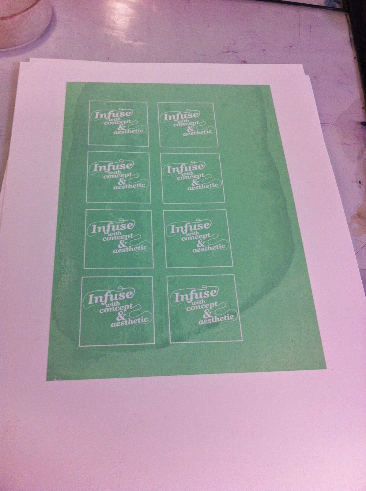
OUGD402 PPP Brief 02 Creating Screen Print Positives
I imported the designs from illustrator into In design. I was originally uncertain about whether or not to make the pattern on the wrapping paper negative or positive space. This is because I am uncertain about the amount of green that the info pack contains.


When constructing the coasters I created circular outlines of 8cm diameter and matched the designs into them.

I then removed the circles so that when cutting them out I can achieve a clean outline when cut out.


The positives for the list book are shown above.

I experimented with a pointed shape for the tea tag but get that it limited the size that it could be. I found that the smallest it could be while still being legible was 4x4cm.

To create a cup sleeve that will work I scanned in one that I collected and traced around it in illustrator, then placed the type design I produced on top of the traced shape.

Thursday 1 May 2014
OUGD402 Reflection on Designing For Competitions
During the Secret 7" Brief I found that designing an album cover really differed from other projects I have done. They seem much more about the emotions they evoke and painting a picture of the essence of the band and the song concerned. Not only this but the fact that I was designing for a competition also changed things. These designs are not simple to sell, but to appeal to certain individuals as well. They need to look like time and care have been channeled into the piece, as if it has earned the right to have a place in the exhibition. I found it really difficult to change my design process and my way of thinking about designs to suit the different kind of design I was producing. This has got me thinking about how fixed in my ways I am as a designer and that perhaps I should re approach this brief next year and focus on changing the way I work depending on the requirements of the brief.
Subscribe to:
Posts (Atom)