Monday 27 October 2014

OUGD502 PPP Personal Branding Research Study Task 1

Because we are being asked to create our own self branding I thought it would be useful, first of all to look into what I produced as part of this module last year but also at professionals self branding and what inspires me and catches my eye.

Lat year my self branding centred around the name, the loquacious student and I created a set of merchandise that fitted together to make a tea set to chat over.

At the time I did feel that this project reflected me as a designer. However, as we talked about it in our first PPP session this year I find that It is not messy enough for me now. To elaborate, I mean that over the summer I have increasingly depended on my drawing and hand rendered type skills. I appreciate the work I do this way much more and I enjoy the process in a much more tangible fashion. I also think that it shows a limited message when it comes to my skills as a designer because although it shows that I can use screen print and come up with a solid idea, all it is showing is typographic prowess, and nothing that amazing at that.

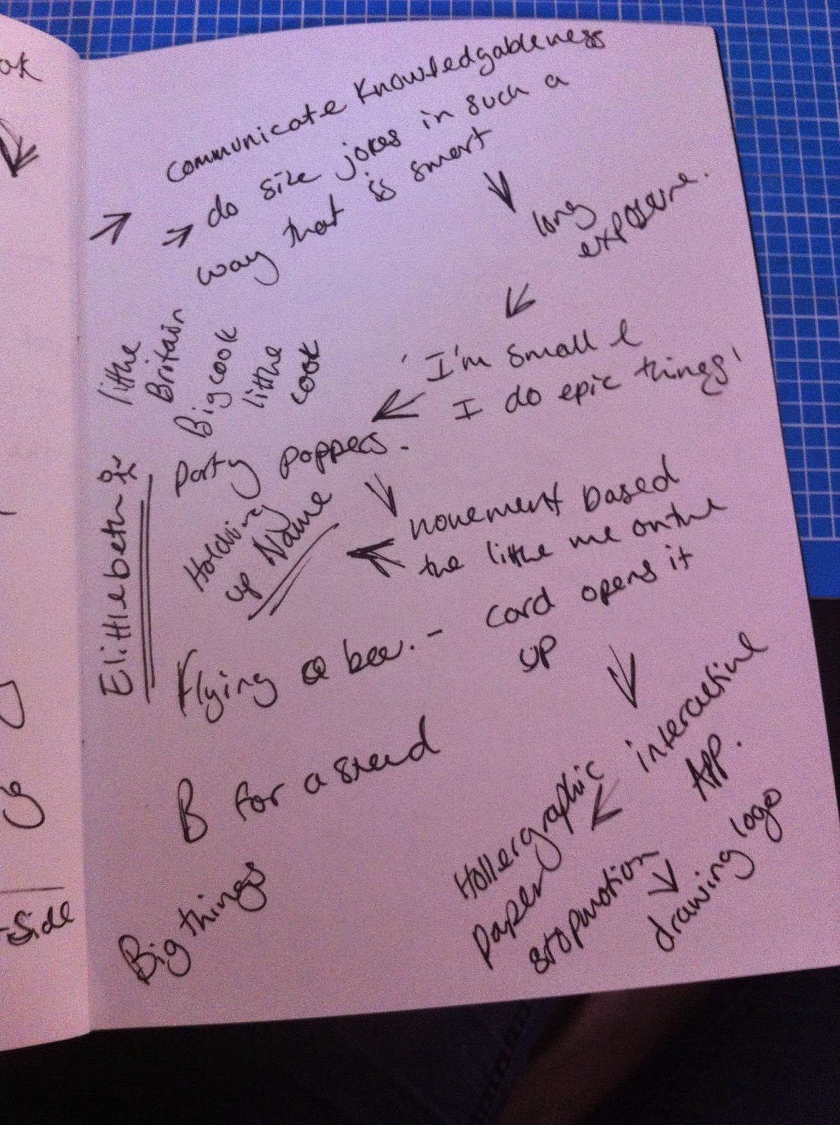
So, of this years self branding project I want to do something more illustrative and hands on, because this really communicates that I like to produce my work physically even though I do have an awareness of digital tools.

When I was looking at some website designs for my web design brief I found quite a few portfolios that had interesting brands and logo designs so I will bring these across from that brief and look at them from a branding stand point rather than a web design one.


It can't really be seen in this screen shot but this is the home page logo of the portfolio of Richie Jacobs. He is partially a front end designer as well as a graphic designer. So it is quite minimal design that works well in a digital situation. The tracking of the lettering is really interesting and creates a distinctive look to an otherwise simple font. Although this bares very little resemblance to the logo I want to create for myself, it has the distinct sense of self and continuity of brand. This it achieved by repeating the clean lines and block colours suggested by the font chosen.


I really like the mix of hand drawn type and a digital format. This is closer to the feel and essence that I want to create in my own logo. This is a mix of media that has interested me for a while and something that I need to consider when designing my logo because although the first port of call will be print it needs to look good in digital formats as well, in situations such as my blog or an online portfolio. However, this seems to be created using pixelated images rather than vector graphics which would not actually work well for either print or screen because loading it on a web page is slow and sizing it up for various print dimensions is difficult.


The process of this caught my eye more than the design its self in this situation. This is in fact something that I found a few weeks ago on Pinterest but it seemed relevant in this situation. I believe that this was created using the latest advances in letterpress, in which the design is printed out onto a 3d polymer plate that is then coated wit ink and imprinted into the paper. I love the tactility that this provides and I think this could work really well with some really punch hand drawn type. So, it looks like I need to form a collection of type styles that I could draw from when designing my logo.


Saturday 18 October 2014

OUGD504 and OUGD502 Reflection On Branding and Illustration

After doing both briefs one and two of the first studio module, I have found that I have realised things about my own practice. I found that I absolutely loved the illustration part of the first brief, the freedom and experimental process of the whole thing was loverly but I found that I wasn't that pleased with the outcome. Where as designing the logo was a real slog. I had trouble coming up with and refining ideas but in the end I was real happy with what I had produced. Perhaps these instances were just one offs but I think I need to find my own way of melding hand drawn elements and digital processes in a way tat allows me to really enjoy the process of design and create a finished product that I am happy with.

OUGD502 Brief 01 Self Branding Seminar/Workshop

Because coming up with a logo and brand for ourselves as designers is part of the first brief of this module we had a seminar simply looking at the importance of self branding and why we need it going out onto the job market for the first time.
A brand is needed for individuality, to separate you from the masses of other people looking for jobs in the same sector. Our brands need to encompass and represent us, focussing on our unique selling points as designers and creatives. To convince possible employers that they want you rather than anyone else.
John talked us trough his meted of approaching a branding design; product, range and distribution.
In tis instance we are the products, the range is the skill set and knowledge that we have and the distribution is how we are going to get that information to the people that count.

The identity we need to convey is simply...me. We went on to talk about (in groups), who and what we are, how we would define this, the services we can provide as individual creatives and evaluate how we would go about communicating and delivering this information.

In the brief we were told that we would need to produce a pack that would be the format of application for the brand we develop. Of course the first things I thought were business cards and merchandise. However, as we got talking about this we soon realised that this could be taken differently, it could be digital, especially if we were seeking to work over seas. There are any number of possibilities and I need to be careful not to block off the more outrageous and creative ones.
We were then shown a Ted Talk by Jacob Cass, the owner and creator of Johnny Cupcakes. It is fascinating to hear not only ow he created the business but how the brand grew from the ethos of the company and how this was realised visual and conceptually i.e. bakeries that don't sell bread.


We the got into groups and talked about each of us individually and how we were perceived by others. I got a lot of information regarding the hands on approach to design that I have and funnily enough the way that I speak; properly or in an old fashioned manner but also very enthusiastically. 


We then did an exercise where we put our names at the top of a piece of paper for people to write word associations about us and our identity on. Something that crept up a lot was this idea of the traditionally English with some sort of twist. This could be an area for further development. I also think the scale element might be something to play on, somehow making fun of my own hight, because it is something that everyone notices about me.

Along this theme of size I came up with the name Elittlebeth as a play on Elizabeth. I really like this and want to develop this idea further. Although, this traditionally English area should be explored to.

OUGD502 PPP Module Briefing and Brief 01

The basis for this years PPP is the individual research into where each of us want to go and what we want to achieve after we graduate. This will be through both reflective blogging and set tasks and seminars. This will help develop our own identity as designers. 

Brief 01:

We were asked to consider what kind of industries we each want to go into because we can all be more than simply graphic designers. For me I suppose this would err towards the more illustrative and hand drawn type areas but I am very aware tat I don't want to cut off any discipline. I want to experience as much as possible. So, I need to do some research into the kind of jobs that are out there that would accommodate this. At the moment I think I need to look at design groups in particular because I love to work with groups of people and these have the greatest opportunities to learn from people in different disciplines.