Tuesday, 16 December 2014

OUGD502 OUGD504 Visiting Professional G.F. Smith


Matthew scharff visited from G.F. Smith to talk us through what they do and what we can get from them as designers.

I was quite surprised to find that they are in fact a third part that buy and sell the paper on but add finishes and touches along with their brand. Their range can be separated into:

Coloured
Coated
Uncoated
Textured 
Special

This is a very simple way of looking at a very large, very varied range of paper. This doesn't include the options of creating layered or duplex papers specific to your needs. They have a very small minimum on orders which allows for small print runs of high quality. They also have mechanisms to ensure that you are getting the paper you need for the job that you are doing. For example, they have a machine that you simply feed a pdf into and it will cut out a packaging net and even score it so that you know the weight of paper will do what you need it to.

Matthew gave us a lot of advice. Perhaps the most obvious but the most useful was the idea of thinking about the stock you are going to use from the very start of a brief because it effects the look and feel of a project so drastically. He showed us a lot of examples of money saving book folds and binding that were really inspiring and possibly usable as an inspiration for the program design for the Leeds Arts Party Program as part of my responsive module.

I had no idea about this but apparently you can buy paper directly from G.F. Smith but perhaps the best way to do so is to tell the printer the specific stock that you want used and they will contact the paper supplier because they know all the technical details that you might not for the printing process.

The colourplan range is one of the most popular ranges that G.F. Smith has on offer. They even have a downloadable colour pallet that you can work with digitally so that you can mock up designs against the colours of stock available through colourplan. Suprisingly they only stock 2 coated papers one of a more grained organic look and the other more classically photographic.

They have a new service where they make one of books to specific specifications. This will coast around 100 a pop but is good possibly for a portfolio or something that you want to keep forever. There is a cost calculator online to allow you o work out the specifications you want to achieve. The best way to order small paper samples is through the papersmith section of the website.

Although I couldn't find an image of it he showed us a map from one of their exhibitions. It was cleverly using layered colour paper that folded up in a three dimensional fashion to show the location of parts of the exhibition. This could be a great inspiration poit for the map I need to design for the Leeds Arts Part conference. 

Sunday, 7 December 2014

OUGD502 PPP Improving Photography

I have been aware for quite some time of my lack of photographic skills and knowledge, so in order to mediate this I have started using Instagram. I know it seems quite a minimal action but not only odes it have a great number of designers using it to promote their work, it makes me think about the composition and lighting of every photo in a way that I have never had to do on a regular basis.

Tuesday, 2 December 2014

OUGD502 PPP Visiting Professional The Print Project Ideas For Self Branding

 Today we had a workshop from Nick from the Print Project. We learned how to design and work with setting wood type.

We worked with proof presses to do simple prints of our designs.

We had quite a few sizes and style of type to choose from.


The furniture used to hold all the letters in place was quite difficult to get used to but had the feeling of a real craft to it. I can see that this kind of job would be one that required patients and an endless eye for detail. I really loved it though. This is possibly I want to look more into.


I know from my COP project last year that there are ways to letter press our own digital designs. This is something of particular relevance to hand drawn type. I talked to Nick about wether or not this would be possible at the print project and he talked me through the etching process they use to create images and ow this could be used with hand drawn type. I think I will look further into this and possibly think about getting in touch with him about giving this a try.
I had a few goes at trying t piece together my self branding but in no situation did it feel like this was the right format for it. It has a softness to it but it feels a touch industrial for me.

Saturday, 29 November 2014

OUGD502 PPP Self Branding Development Sketches

I started by printing out a didot version of the name of my brand. I like that this has an edgy classic look to it but I don't feel it is soft enough or organic enough to represent me.
I used the light box to try and add in some flourishes that were drawn from the idea of ink droplets extending from the letters or languid brush strokes, trying to add in my hands on practical approach to design.

I found problems with the kerning came out a lot when I did this, effecting the way the word was read.

I talked to people in the studio about this and they suggested a more A symmetric approach and not feeling obliged to balance out the ornamentation.

So, I tried illuminating just the letter E but this effected the legibility too much and detracted from the word.

I kept trying but I just felt this approach wasn't working. So, I tried drawing over the entire word and reshaping the letters themselves rather than just adding embellishments.

I tried adding textures of pen colouring to unfished letters to suggest the method with which they were created (hand drawn).

I tried using a paint brush and drawing inks to do the same but to no avail. It just looked rough and unfinished not hands on and cared for.

I tried taking the varying stroke wieght of the font I had chosen to start with and creat an almost illuminated letter for the start of the word but I just hated it, it just felt awakward and un expressive.

I went back to my pinterest board for this project and started to rethink the placement of the letter. Why should they al be in a straight line? I went back to small thumbnails and looked at changing the size of the letters to express the idea of someone small doing something big.

I played wround with stacking and moving the words to create a hierarchy of information and considered a water mark for a while with a large and small L sitting inside one another but the only one that remotely caught my eye was the one of the far left.

I looked at drawing it larger, trying out some brush pen calligraphy but again I am unconvinced.

I was loosing momentum at this point but tried out the water mark idea again with a large L and  little b, drawing on the brush pen calligraphy. I think that I need to go back to the beginning again and render the entire thing by hand. This is the only way that tends to work for me. 

Thursday, 27 November 2014

OUGD502 PPP Evaluation of Development

Today in a short presentation about the PPP module John asked a few questions to stimulate the evaluation of our personal progress and how we feel we have changed over the summer. So, I thought I would go through them and answer them to the best of my ability to try and stimulate some more ideas about my self branding project.

What are your aspirations?

-I would have to say that my aspirations are everything. I simply want to do and experience as much as possible. I want to work out of the country and collaborate withe new and exciting people. Most of all I want to be part of a design team. I need the banter, the give and take of a social scenario in order to design at my best.

Has anything in particular affected you over summer?

-I guess the thing that has affected me the most would be that I had my first job. I was a waitress. This iOS something that has really taught me what stress really is. To understand how to roll with the punches and most of all not to procrastinate and just get on with things. This has allowed me a much more mentally balanced approach to this year of the course. I feel that even though the work load is heavier, I know how to deal with it and have enough confidence in my self that I feel I am regularly doing my best with designs. This is the most important thing to me; even though the designs might not be the best in the world, if I feel that I have done the best I could, I am content.

What do you want to change in your practice?

-I want to refine my illustrative approach to design. As I have come into the second year I have been much happier implementing a design approach that is much more hands on and much less screen based. Not only does this help me to achieve an aesthetic that just feels right to me and make me feel like I have produced something with while and real, it also makes me enjoy the process of design 10 times more. I want to do this to a greater degree and have more creative freedom to use slightly crazy artistic approaches.

If you had any experience of professional creative practice, did you feel up to scratch?

- Yes, Over summer I had my first real life paid piece of graphics design. I was a brief passed on to me by two freelance graphic designers so it was quite relaxed and open. I really enjoyed the brief and in the end felt like I had produced something that both the client and myself were happy with. What more can you ask for!
What influences you the most?

Did you meet anyone that inspired or interested you?

-As well as meeting Alex and Steve who were the freelance designers that passed on the brief mentioned above, I also met a woman called Judith. She runs the small cafe that I worked in over summer and she made me realise that what I though was a high work load was in fact pittance. She did everything from making the cakes to the accounts and never stopped. Although I don't want this life style for myself I feel that if you try you could pretty much deal with anything.

Tuesday, 25 November 2014

OUGD502 PPP Studios That Inspire Me

I have spent some time looking at studios that have the illustrative edge that my work is progressively moving towards and I have found some great work and designers that are just incredibly inspiring. 


John was right when he said that the blogs are the best place to find their true creative voices and inspiring work. What I really love about them is their unashamed enjoyment of the wacky and wonderful. In short I guess I just like enthusiasm and their work is just the visual incarnation of enthusiasm, be it a little disturbing at times.


Vault 49 is a studio I found when looking for studios based in New York. This is simply indulgence on my part because I would really love to live and work in New York some day, simply because I want to experience it. their work is again very illustrative and I looked at their internship program but they seemed very unwelcoming and harsh about it so I have rather gone off them but not their work.


OUGD502 PPP Leeds Arts Party Flyer Work and The Showcase Spectacular in the Corn Exchange

This is the first real life responsive brief. I produced a A6 flyer for the stand the Leeds Arts Party had at the showcase spectacular at the corn exchange last weekend.
I came up with the tag line; create, celebrate, educate and worked it into the design. If you want to see the full development behind this design follow the link.

I helped out on both days of the showcase and on the saturday they asked me to produce some chalk board type with some questions to stimulate thought and conversation. they gave me the questions and let me do what I wanted with the layout. 

This is the first time I have ever really down chalk board type on a chalk bird but I am amazed by how much I enjoyed it. I would really like to cultivate this skill in the future so that it is something I can add to my repertoire. 

I had a lot of fun doing this and meeting all of the artists that had stalls at the showcase. I got talking for a long while with a lot of them and regularly got asked if I had a business card. This just goes to show that I really need to get on top of this self branding work because it really will come in handy. People were very good natured about me writing down my details when I explained that I was currently working on my business card designs, invariably starting off another conversation about the impermanence of self branding, but none the less this was a very positive experience for me.


Sunday, 16 November 2014

OUGD502 PPP Self Branding First Ideas


After doing some research into self branding I made a list of the considerations and limitations of the brief.
I then came up with a few starting ideas. These centred around tactility and the role tis has always played in my process.

I also went down to the laser cutting suit to check that it is possible to etch into stone and it is but I need to consider how flat the surface that is being cut into is because this can create some blurring of the visual.

Monday, 27 October 2014

OUGD502 PPP Personal Branding Research Study Task 1

Because we are being asked to create our own self branding I thought it would be useful, first of all to look into what I produced as part of this module last year but also at professionals self branding and what inspires me and catches my eye.

Lat year my self branding centred around the name, the loquacious student and I created a set of merchandise that fitted together to make a tea set to chat over.

At the time I did feel that this project reflected me as a designer. However, as we talked about it in our first PPP session this year I find that It is not messy enough for me now. To elaborate, I mean that over the summer I have increasingly depended on my drawing and hand rendered type skills. I appreciate the work I do this way much more and I enjoy the process in a much more tangible fashion. I also think that it shows a limited message when it comes to my skills as a designer because although it shows that I can use screen print and come up with a solid idea, all it is showing is typographic prowess, and nothing that amazing at that.

So, of this years self branding project I want to do something more illustrative and hands on, because this really communicates that I like to produce my work physically even though I do have an awareness of digital tools.

When I was looking at some website designs for my web design brief I found quite a few portfolios that had interesting brands and logo designs so I will bring these across from that brief and look at them from a branding stand point rather than a web design one.


It can't really be seen in this screen shot but this is the home page logo of the portfolio of Richie Jacobs. He is partially a front end designer as well as a graphic designer. So it is quite minimal design that works well in a digital situation. The tracking of the lettering is really interesting and creates a distinctive look to an otherwise simple font. Although this bares very little resemblance to the logo I want to create for myself, it has the distinct sense of self and continuity of brand. This it achieved by repeating the clean lines and block colours suggested by the font chosen.


I really like the mix of hand drawn type and a digital format. This is closer to the feel and essence that I want to create in my own logo. This is a mix of media that has interested me for a while and something that I need to consider when designing my logo because although the first port of call will be print it needs to look good in digital formats as well, in situations such as my blog or an online portfolio. However, this seems to be created using pixelated images rather than vector graphics which would not actually work well for either print or screen because loading it on a web page is slow and sizing it up for various print dimensions is difficult.


The process of this caught my eye more than the design its self in this situation. This is in fact something that I found a few weeks ago on Pinterest but it seemed relevant in this situation. I believe that this was created using the latest advances in letterpress, in which the design is printed out onto a 3d polymer plate that is then coated wit ink and imprinted into the paper. I love the tactility that this provides and I think this could work really well with some really punch hand drawn type. So, it looks like I need to form a collection of type styles that I could draw from when designing my logo.


Saturday, 18 October 2014

OUGD504 and OUGD502 Reflection On Branding and Illustration

After doing both briefs one and two of the first studio module, I have found that I have realised things about my own practice. I found that I absolutely loved the illustration part of the first brief, the freedom and experimental process of the whole thing was loverly but I found that I wasn't that pleased with the outcome. Where as designing the logo was a real slog. I had trouble coming up with and refining ideas but in the end I was real happy with what I had produced. Perhaps these instances were just one offs but I think I need to find my own way of melding hand drawn elements and digital processes in a way tat allows me to really enjoy the process of design and create a finished product that I am happy with.

OUGD502 Brief 01 Self Branding Seminar/Workshop

Because coming up with a logo and brand for ourselves as designers is part of the first brief of this module we had a seminar simply looking at the importance of self branding and why we need it going out onto the job market for the first time.
A brand is needed for individuality, to separate you from the masses of other people looking for jobs in the same sector. Our brands need to encompass and represent us, focussing on our unique selling points as designers and creatives. To convince possible employers that they want you rather than anyone else.
John talked us trough his meted of approaching a branding design; product, range and distribution.
In tis instance we are the products, the range is the skill set and knowledge that we have and the distribution is how we are going to get that information to the people that count.

The identity we need to convey is simply...me. We went on to talk about (in groups), who and what we are, how we would define this, the services we can provide as individual creatives and evaluate how we would go about communicating and delivering this information.

In the brief we were told that we would need to produce a pack that would be the format of application for the brand we develop. Of course the first things I thought were business cards and merchandise. However, as we got talking about this we soon realised that this could be taken differently, it could be digital, especially if we were seeking to work over seas. There are any number of possibilities and I need to be careful not to block off the more outrageous and creative ones.
We were then shown a Ted Talk by Jacob Cass, the owner and creator of Johnny Cupcakes. It is fascinating to hear not only ow he created the business but how the brand grew from the ethos of the company and how this was realised visual and conceptually i.e. bakeries that don't sell bread.


We the got into groups and talked about each of us individually and how we were perceived by others. I got a lot of information regarding the hands on approach to design that I have and funnily enough the way that I speak; properly or in an old fashioned manner but also very enthusiastically. 


We then did an exercise where we put our names at the top of a piece of paper for people to write word associations about us and our identity on. Something that crept up a lot was this idea of the traditionally English with some sort of twist. This could be an area for further development. I also think the scale element might be something to play on, somehow making fun of my own hight, because it is something that everyone notices about me.

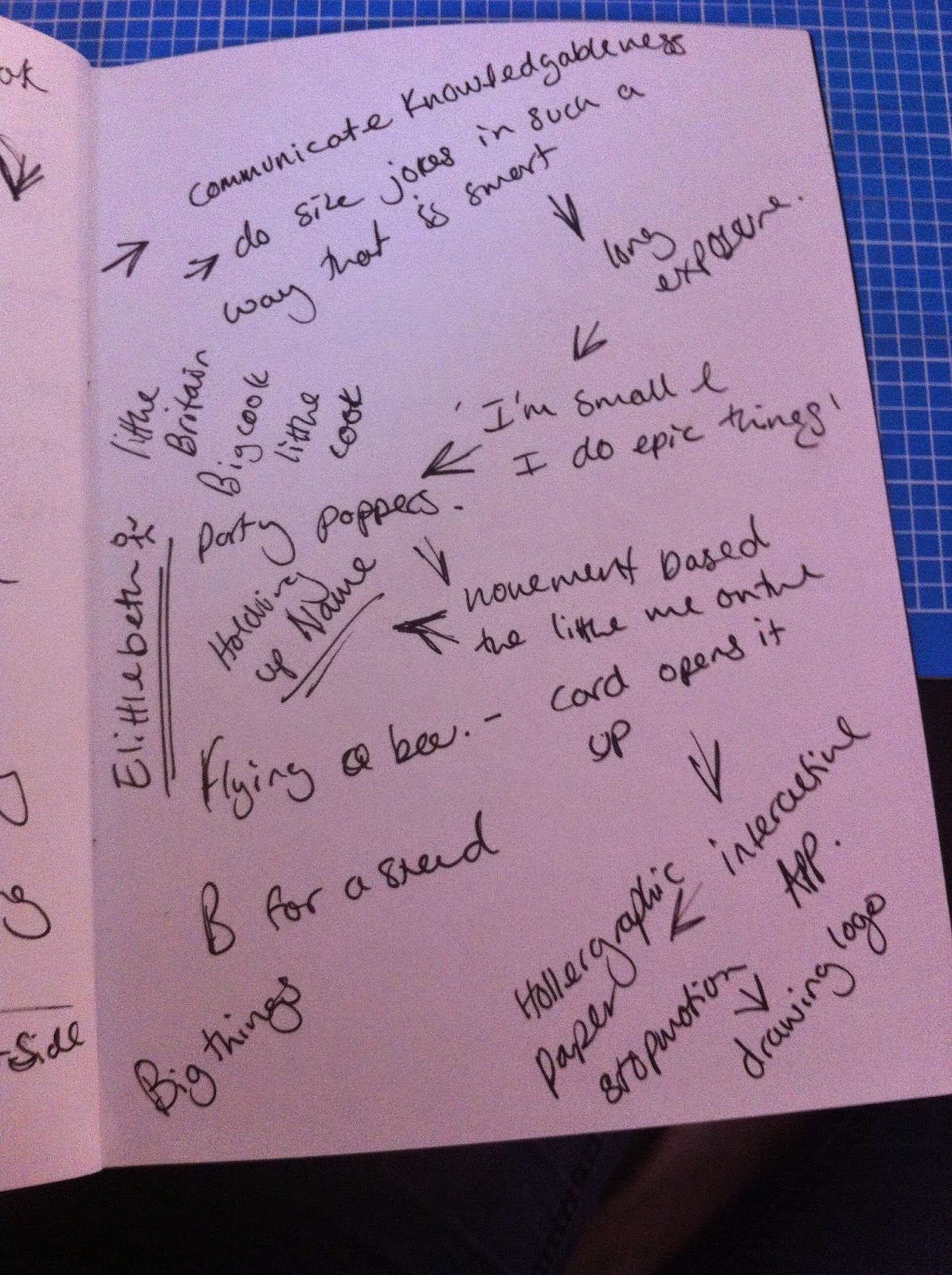
Along this theme of size I came up with the name Elittlebeth as a play on Elizabeth. I really like this and want to develop this idea further. Although, this traditionally English area should be explored to.

OUGD502 PPP Module Briefing and Brief 01

The basis for this years PPP is the individual research into where each of us want to go and what we want to achieve after we graduate. This will be through both reflective blogging and set tasks and seminars. This will help develop our own identity as designers. 

Brief 01:

We were asked to consider what kind of industries we each want to go into because we can all be more than simply graphic designers. For me I suppose this would err towards the more illustrative and hand drawn type areas but I am very aware tat I don't want to cut off any discipline. I want to experience as much as possible. So, I need to do some research into the kind of jobs that are out there that would accommodate this. At the moment I think I need to look at design groups in particular because I love to work with groups of people and these have the greatest opportunities to learn from people in different disciplines.

Thursday, 4 September 2014

First Real Life Brief

Recently a couple of self employed graphic designers have moved in next door. We go talking and they soon gave me one of the briefs they had just got for a logo design for a web design company just starting out. This is war I received.

Hi Beth,

Hope you got your photography sorted

As you know the brief is, there is no brief - so just have a play

His web address is www.aimhighsbs.com

Plus Logo colours he likes


Hand rendered type is something tat I am very passionate about at the moment and so I wanted to use this brief to learn to do brush pen calligraphy. I felt this would really match the directional connotations that the name 'Aim High' Had and The logo needed to have more hand made connotations than it currently had. I new though that I needed to talk him out of 'small business solutions' because that doesn't communicate that the company is mainly involved in web design. I started out by just experimenting with the shapes the words would make.

 Then honing my use of the bush pen which took some time.

I looked at combining digital and hand drawn type but it interrupted the flow of the words.


Once I had improved my skills considerably I looked at the ornamentation properly.


Then began to strip it back to basics.

 Below is the sketch that I sent to the client. The idea was that the arrow was a kind of hand glider, suggesting flight in an upward direction.

I sent a color option sheet once i had gotten the go aead for the general logo.

I then spent some time beefing up the type so that it worked well bot as a small and large version.