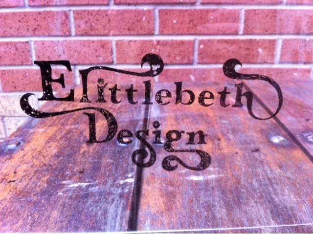
This was a bit spare of the moment, but through experimentation the lettering design was transferred to acetate via felt tip.

It creates a really nice texture where the grease on the plastic stops the ink in the fleet tip from fixing fully to the surface.

It works quite well over a soft focus image, as cane bee seen from all of the above.


Some background textures are less conducive to legibility than others, so for maximum flexibility, which is required in a brand, this design would need to be digitised in some way.


However, as soon as this happened the project hit a snag. The uneven edges created by the texture of the ink on plastic combined with the large flourishes of the text instantly connote pirates. Not something I wanted to communicate. Indeed it seems that the definite edges of the design are what makes it so distinctive, the obvious next step it to vectorise in illustrator.
No comments:
Post a Comment