Once I had the design for my branding and the lettering for the back of my business card detailed in the last quote, I had to create the full designs.

I looked at the back first because this was the one I thought I would have most trouble wit, because of the large amounts of information needed in such a small place.

I chose a tall narrow format that would read portrait on the back and landscape on the front (I will have to try out the ergonomics of how this will turn in the hand). The small format is just another way of applying the theme of small to everything for continuity and individuality.

For the info on the card I knew I needed a strong typographic contrast to make the mix work. I tried a number of options looking at negative space so that the wood left behind by the laser cutter would be strong enough to create a tangible impression in print form.

After last years branding I thought what I wanted to do was return to a kind of green because there really is no other colour that represents me. However, I have also looked at creating a soft rusty autumnal orange that I think could work really well in web and print (from previous projects where I have worked with these shades).
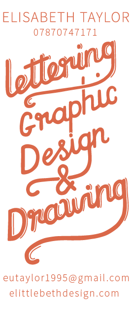

I already had a definite design in mind for the front of the business card and this was one of those times that it just worked out. The type needed to be light and sharp again to create contrast and source sans pro light did the job with a little extra tracking.

I then reversed the designs because the laser cutter with etch away the black area leaving the stamp. I have a few concerns about the thinness of the source sans pro light and iff the MDF will take such thin cutting. So, I also mocked up designs with a semi bold version of the font which surprisingly still looked great!


No comments:
Post a Comment